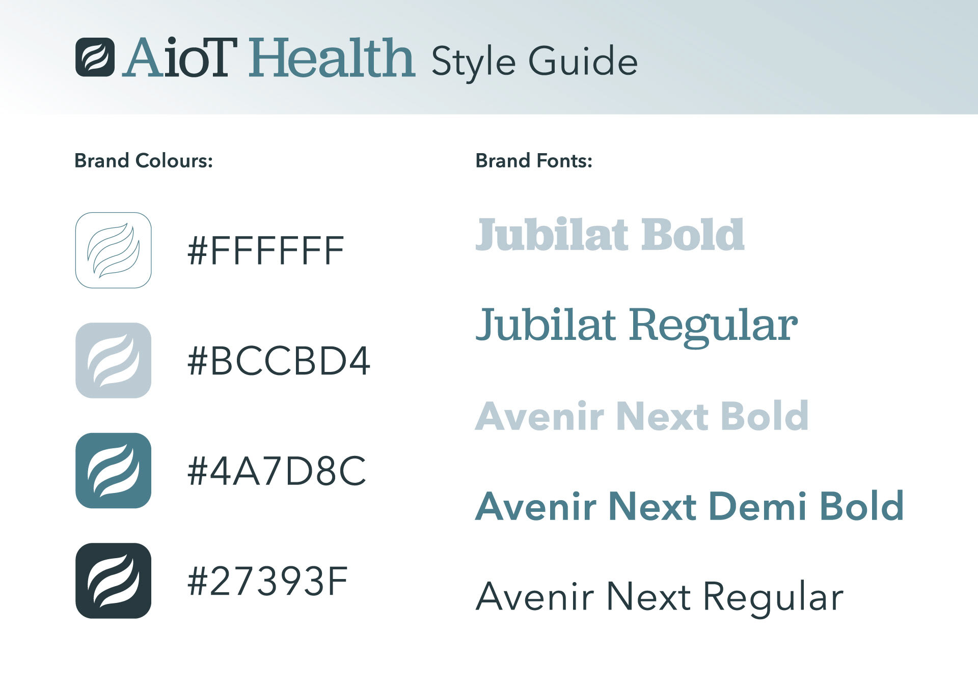
AioT Health is a health technology fund investing in early stage companies in the medical field. I've been working with them for a few years as a freelancer, redesigning their investment memos and pitch decks. I've been working with one of the founders since my onboarding to evolve their brand into one that feels elevated and cohesive. Last year I was approached to change one letter in the logo and took the opportunity to make a few logo changes and establish clearer brand guidelines. Here are the results:
Here is the original logo with my notes for updates.
After a few iterations, we ended up with this updated logo.
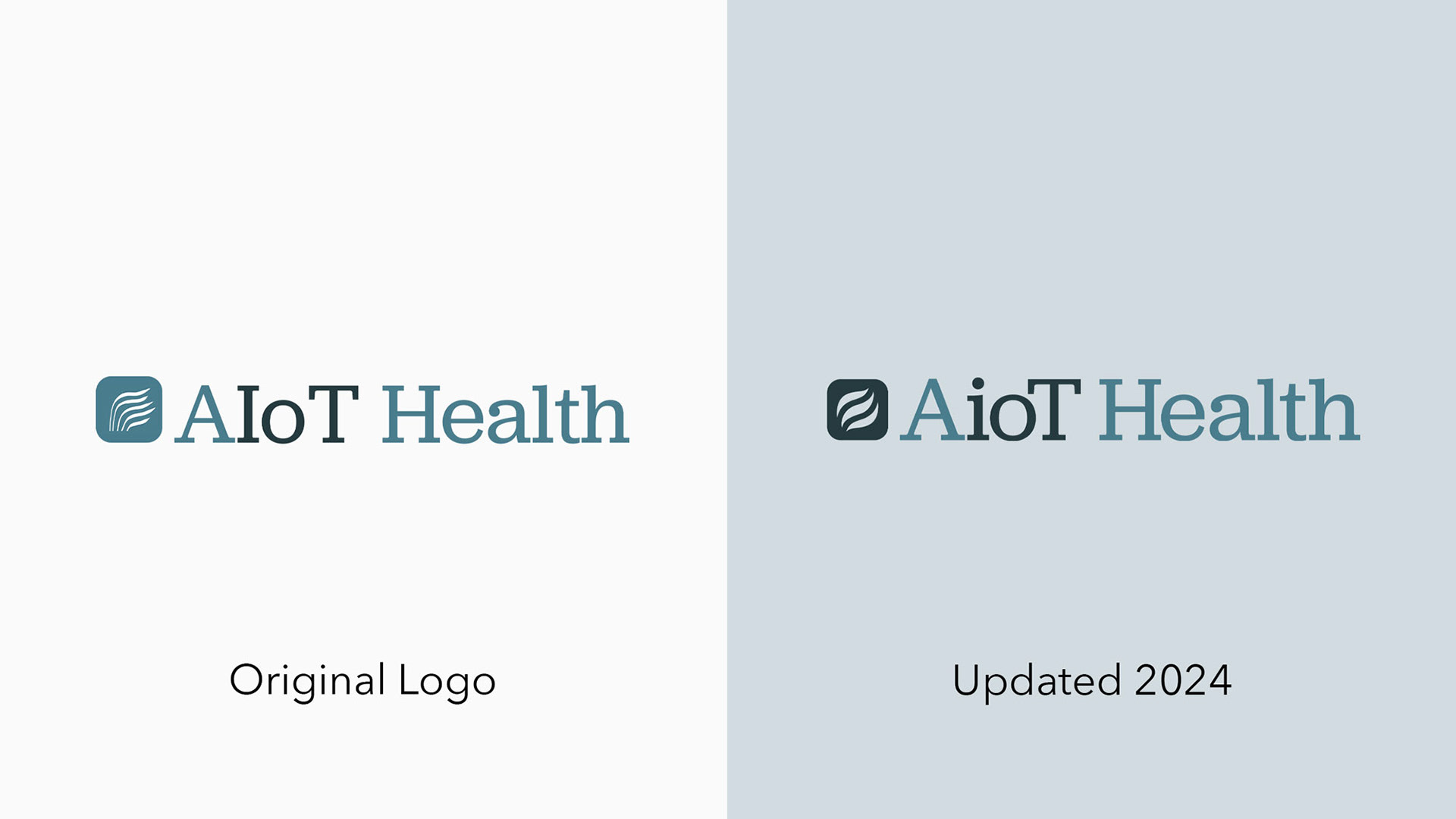
While the changes may be subtle. The new logo has more balance and visual clarity than the original.
Logo in Use
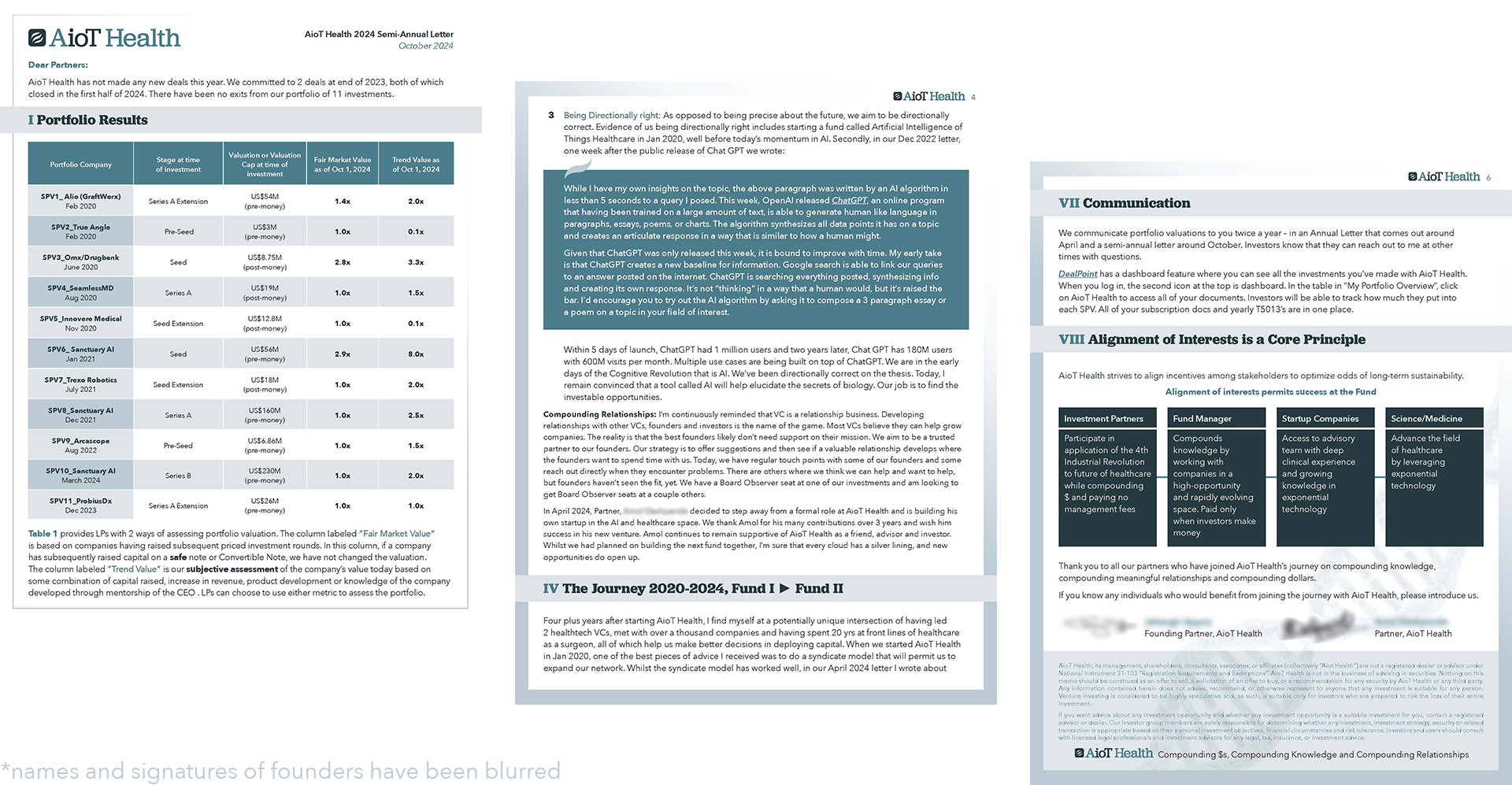
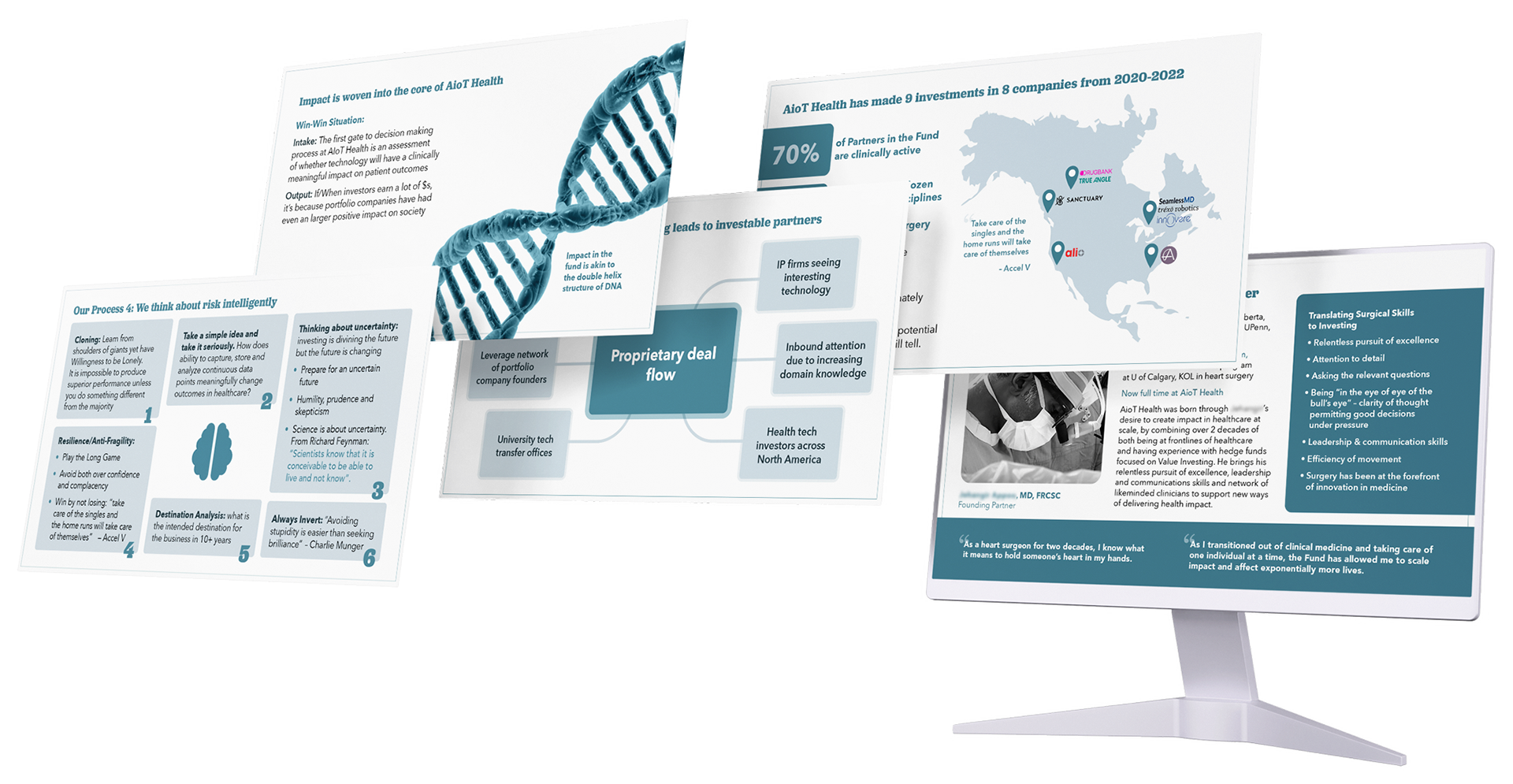
Here are some marketing materials I created using the updated logo.